

Last month The Data Lab was very pleased to partner with data visualisation guru Andy Kirk on a one-day workshop at the G&V Royal Mile Hotel in Edinburgh, as part of our mission to bring leading data experts to the Scottish community. My colleague Caterina Constantinescu and I were in attendance, along with around forty others from local businesses, public and third sector organisations. In this post I review the day, which reinforced in my mind how important yet often sadly overlooked the element of visually communicating data science analysis is.
Andy Kirk’s background
Andy Kirk is arguably the best-known data visualisation specialist in the UK today. Through his company Visualising Data he provides a plethora of services around graphical ways of telling “data stories”. These include but aren’t limited to consultancy, training, lecturing and research, whilst he also finds time to maintain the hugely resourceful website above, write books, and talk at conferences. It was in this latter capacity that I first had personal contact with him, as he was an extremely engaging speaker at DataFest back in May.
Workshop Overview
The first thing to say about the Data Visualisation and Infographic Design Workshop was that it was very full-on. It was clear right from the outset that there was a lot of material that Andy wanted to get through, and whilst there were the obligatory breaks for coffee and lunch there was no time for slacking when it came to the work.
The workshop was very cleverly structured to lead us on a journey from visualisation novices to more critical thinkers. As he stated, it was targeted at helping anyone
…know what to think, when to think, and how to think about creating the most effective data-driven designs in the most efficient way.
We started by critically evaluating some infographics, and were then educated in how to structure our thinking when putting together a data vis. Through staged processes we looked at formulating a brief for the visualisation, familiarising ourselves with the data, thinking editorially, before finally looking closely at specific elements of design.
All throughout the workshop there was a well-balanced mix of learning about and then applying the “dark arts” of good data visualisation, and this definitely helped in taking concepts on board and reinforcing the messages Andy was giving.
Some Specific Examples
Whilst Andy is a data-driven designer himself, I think I’m right in saying that all of the examples we were given came from the public domain. These were of the type that one would commonly find in any newspaper or magazine, meant to graphically illustrate the text and add insight for the reader. For the majority of those in attendance at the workshop, data visualisations are usually for internal purposes in relaying the findings of some piece of analysis or research, but of course the same general principles hold.
Now that I am better-versed in the intricacies of constructing a data visualisation I am tempted to label any that I see as The Good, The Bad, or The Ugly (my turn of phrase, not Andy’s). In fact maybe a better categorisation for the latter is The Confusing, since one realises that there are some visualisations that with a few tweaks gained from knowledge given at the workshop could actually be made much better.
Below are three images that were used within the workshop, together with the source URLs. I’ll leave it to the reader to decide whether they think the examples should belong in The Good, The Bad, or The Confusing category. Please leave comments below and let me know what you think!
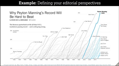
Source: New York Times
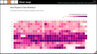
Source: The Daily Viz
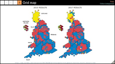
Source: New York Times
Conclusion
It is impossible to write about all of the topics that Andy covered on the day. As well as the design process and critical thinking messages mentioned above we also learnt about many new graph types, spoke about the technical tools of the trade, and were given links to useful repositories for data visualisation. I’d refer the interested reader to Andy’s website as the best place to start to find out more.
For me as a data scientist there were two main things that got me thinking beyond the material. The first of these is that creating visual stories on the analysis we carry out demands every bit as much attention as we give to the choice of architecture/language/algorithm etc. Quite often the time we allocate to the presentation of results can be squeezed, but with a little more planning and knowledge of how to best convey information we can avoiding undoing all the good work that has gone on beforehand.
The second point that occurred to me was how many of Andy’s (“Good”) examples came from the US media. I am curious to know whether this simply means that the American data vis producers are leading the field, or whether infact it is because the American data vis consumer is better able to process information in a form other than the common line, bar and pie charts that we tend to see in the UK press.
All in all it was a very enjoyable and educational day. My thanks go to Andy for all the hard work he put in to making it such, and for reminding me that for the modern data scientist there are always new things one can learn and improve upon.
CPD Events with The Data Lab
To ensure you keep up to date with similar events, please check out The Data Lab’s Continuing Professional Development webpage.
Leave a Reply