
Recently I discovered that the UK government collects detailed information about traffic accidents across the country that are being reported to the police. What’s even more interesting is that all these data are being uploaded and made publicly available on the government’s open data website. This dataset, being so rich, immediately caught my attention. I had to do some analysis on it. But, as it’s usually the case in this field, a series of data manipulation and cleaning operations had to take place before diving into the waters of information extraction.
Data Cleaning and Publishing
Information was scattered across multiple csv files, which varied both in regards to the type of information they enclosed and the period of time they covered. Additionally, all the variables in the dataset were coded, essentially rendering any potential analysis non-meaningful to a human reader. Luckily, following the relational paradigm, relevant variable lookup tables were being provided, which I later used to automatically “translate” the coded variables to meaningful textual strings.
Having taken care of all the above, I thought it would be a shame not to share this clean and tidy version of the dataset with the wider data science community for further exploration and analysis. The dataset features information about 1.9 million traffic accidents across the UK, along with details of roughly 2.2 million vehicles involved in these accidents, making this a very interesting and comprehensive dataset for analysis and research. Long story short, the dataset is now publicly available on Kaggle and you can access it here.
Building an App
When it comes to discovering and presenting interesting insights in data, one approach is to produce a static report featuring a plethora of interesting graphs and KPIs. But, for such a rich dataset, I wanted to give everyone the opportunity to explore the data in a dynamic way. And what’s a better way to achieve something like this, other than building an interactive web app using R’s shiny package!
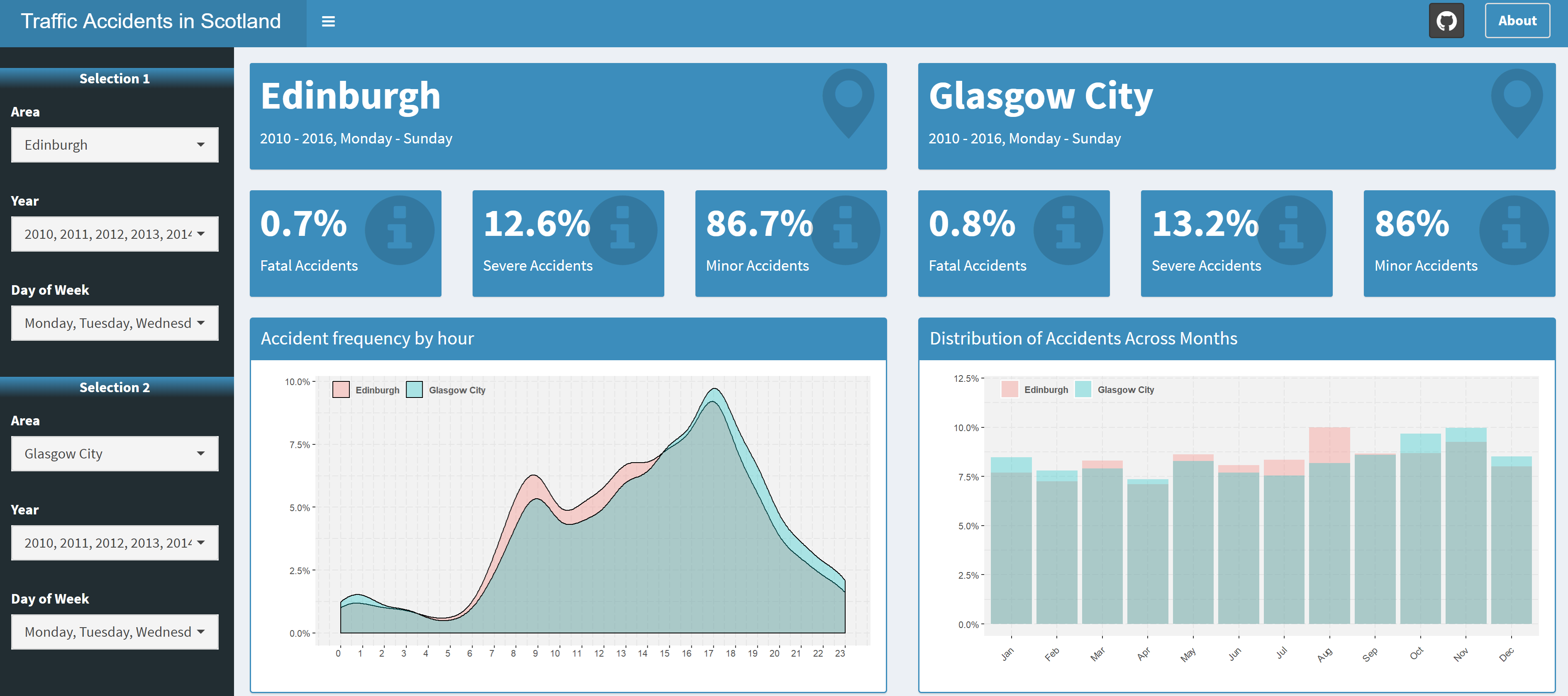
The app enables the user to discover things like: how accidents are distributed across different hours within a day, which is the most accident-prone month and how accidents defer between a work day and a Sunday. One of the main features of the app is that it also lets you compare different areas and time periods, so feel free to play around with the controls to make the best out of it.
The overall design of the app is based on the shinydashboard and shinydashboardPlus packages, while tooltips, popups and loading animations have been added using shinyBS, shinyalert and shinycssloaders.
You can freely access the app on this link and I’ve also made the code publicly available on GitHub.
Some Analysis
Just to showcase what kind of insights we can extract using this interactive dashboard, let’s have a look at the graph that shows the distribution of accidents across months, keeping the default options that compare Edinburgh to Glasgow:
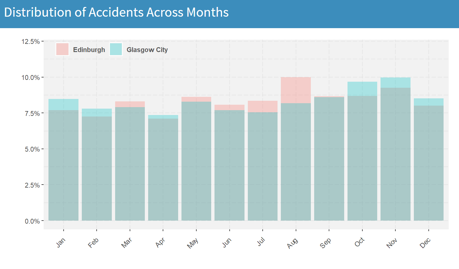
For Glasgow, one can easily observe that the months with the highest accident frequency are October and November. On the other hand, in Edinburgh, August is clearly the month with the highest number of traffic accidents (10% of the total number of accidents within a year). This big spike is most likely caused by the Fringe. The world’s largest arts festival that’s taking place every year in Edinburgh during the entire month of August. When compared to the other summer months (June and July), we can see that August has an increase of roughly 30% in accidents. This information could be of particular use to roadside assistance businesses or even to the police and hospitals, looking to increase personnel availability during this time of the year.
Next, let’s have a look at how accidents occur on different times on a work day and a Sunday. To do this, we set both Area filters to the same option (in this case, Edinburgh), only that in the first case we choose Monday to Friday as days of week and in the second case we choose only Sunday:
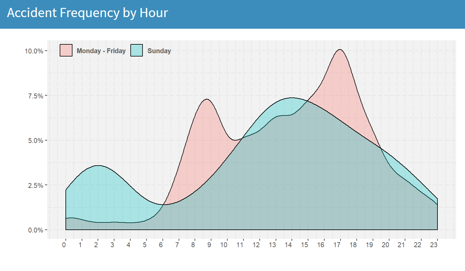
What we end up with is two bimodal distributions of accidents, that are completely different to each other. When it comes to work days, the accident frequency during the early morning hours (1am-5am) is very low, as most people are resting at home. However, as soon as they start commuting to work, the number of accidents sharply increases, reaching a peak somewhere between 8-9 am. Of course, as one would expect, the largest wave of accidents in a work day comes around 5pm, when everyone’s rushing off from work. On the other hand, the effect of the Saturday night out is clearly depicted by the peak of the blue curve around 2am and the relatively low number of accidents during the mid-late morning hours.
Can We Predict Accident Risk?
Absolutely we can, but using only the information in this dataset limits our ability to produce accurate estimations. Nonetheless, I gave it a try.
My approach was to use a few basic features (area, day of week, month, time and whether it’s a bank holiday or not) to train a rather small random forest to predict whether an accident is going to occur within a 6-hour interval in any given area. The model has been integrated in the app in the form of a line chart that shows the predicted risk of traffic accidents in the selected areas for the next 48 hours:
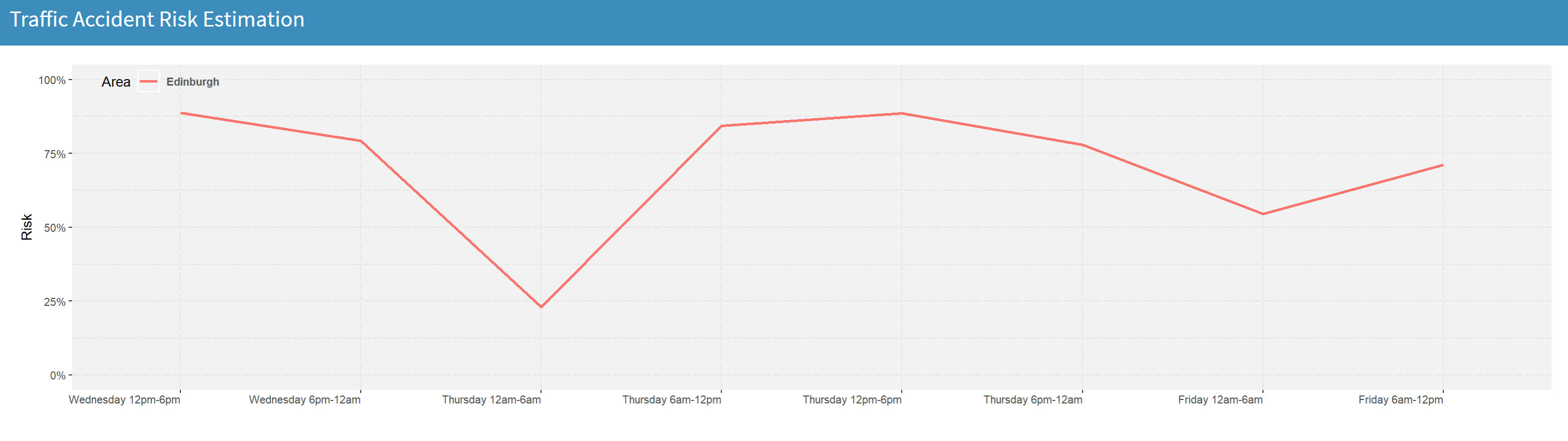
Of course, if we were to build a more robust model for accident risk estimation, we should make sure that we have available additional relevant information. For example, weather conditions for every day and location in the previous years, as well as access to a potential weather forecast API, that would give us the ability to use this kind of information for predicting accident risk in the future.
Have fun exploring the app and using the data!
Relevant links:
Traffic Accidents Web App
Traffic Accidents Dataset on Kaggle
Code on GitHub
Leave a Reply