
Motivation
Most of modern Scotland was once Gaelic-speaking and a policy change in 2010 means Gaelic names appear alongside English names on almost all station signs across Scotland’s railway. I live in Glasgow and often travel out into the highlands and over time I hypothesised:
H1: The Gaelic and English names of a station become more similar the further the station is from Glasgow.
Being a data scientist, I wanted to explore if this is a good or bad hypothesis, and I describe my journey here. Code is on Github for you to run the analysis yourself.
Similarity Measure
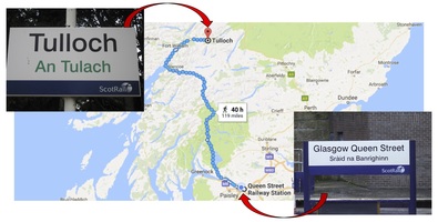
Below are images of two example station signs I used to form my hypothesis. The bottom-right sign is located at Glasgow Queen Street station in the center of Glasgow. The top-left sign is located at Tulloch Station, 119 miles walk from Glasgow.
Being a non-Gaelic speaker, my qualitative measure of similarity between the English and Gaelic names is most likely based on the letters used and whether the names sound similar when I say them (probably wrongly) in my head. A Gaelic speaker might do something different, and it is important to be aware of these differences in experience when designing quantitative measures of similarity.
FuzzyWuzzy
For this particular analysis, I decided to use a similarity measure capturing the differences between the Gaelic and English names of stations as I see them on the sign, i.e. at the string-level. To do this, I used a Python library named FuzzyWuzzy. As an example, it is easy to compute the edit distancebetween the Gaelic and English names of the two previous stations:
from fuzzywuzzy import fuzz
print(fuzz.ratio('Tulloch','Tulaich'))
print(fuzz.ratio('Glasgow Queen Street','Sràid na Banrighinn'))
#71
#21
The output of fuzzy.ratio is always between 0 (no similarity) and 100 (identical match). If we are considering similarity at the string-level, then an edit distance of 21 seems a bit high for ‘Glasgow Queen Street’ and ‘Sràid na Banrighinn’, but let’s proceed with fuzzy.ratio for now.
Data Preparation
Next I needed to gather and prepare some data for analysis.
Collection
I first scraped all the Gaelic and English names of Scottish railway stations from scot-rail.co.uk and downloaded all the locations of UK railway stations from data.gov.uk. After a wee bit of preparation, I imported both datasets using the Python Pandas package.
import pandas as pd
print('\n',pd.read_csv('names.csv').head(7))
print('\n',pd.read_csv('locations.csv').head(7))
#
#          English               Gaelic
#0       Aberdeen       Obar Dheathain
#1       Aberdour        Obar Dhobhair
#2       Achanalt       Achan nan Allt
#3     Achnasheen       Achadh na Sìne
#4  Achnashellach  Achadh nan Seileach
#5      Addiewell         Tobar Adaidh
#6        Airbles                  n/a
#
#               English  Easting  Northing
#0            Penzance   147588     30599
#1  St Ives (Cornwall)   151947     40127
#2          Carbis Bay   152930     38745
#3             St Erth   154150     35730
#4     Lelant Saltings   154430     36640
#5              Lelant   154770     37220
#6               Hayle   155970     37325
Cleaning
For some reason, 67 out of 357 Scottish railway stations do not have Gaelic names. Given it is a minority, I decided to remove these stations from this particular analysis. To do this, I found the first station with no Gaelic name and used its Gaelic name placeholder to identify and remove the others:
names = pd.read_csv('names.csv')
names = names.loc[names['Gaelic'] != names.loc[6].Gaelic]
Combining
Next I used Python pandas to (inner) join the two tables:
locations = pd.read_csv('locations.csv')
data = pd.merge(names, locations, how='inner', on=['English'])
print('\n',data.head())
#
#          English               Gaelic  Easting  Northing
#0       Aberdeen       Obar Dheathain   394127    805872
#1       Aberdour        Obar Dhobhair   319100    685400
#2       Achanalt       Achan nan Allt   226020    861473
#3     Achnasheen       Achadh na Sìne   216403    858519
#4  Achnashellach  Achadh nan Seileach   200290    848440
Transforming
If you’re not familiar with Easting and Northing coordinates, the values correspond to the displacement (in meters) of each station from a given reference point. I wanted to map these values to the more commonly used Latitude and Longitude coordinates, but I could not easily find the location of the neccesary reference point. Frustrated with looking, I decided to hack a solution. I Googled the Latitude and Longitude of Glasgow Queen Street (GQS) station and used the Python utmpackage to find the Easting and Northing offsets of GQS in the data:
import utm
GQS_latlon = (55.8623,-4.2511)
GQS_ref = utm.from_latlon(*latlon)
GQS_row = locations.loc[locations['EnglishName'] == "Glasgow Queen Street"]
E_off = int(GQS_ref[0] - GQS_row['Easting'].values[0])
N_off = int(GQS_ref[1] - GQS_row['Northing'].values[0])
Using these offsets I was able to replace the Easting and Northing columns with the Latitude and Longitude coordinates of each station, leading to a data frame of the form:
print('\n',data.head())
#
#          English               Gaelic      Lat     Lon
#0       Aberdeen       Obar Dheathain  57.1262 -2.0646
#1       Aberdour        Obar Dhobhair  56.0470 -3.2953
#2       Achanalt       Achan nan Allt  57.6153 -4.8661
#3     Achnasheen       Achadh na Sìne  57.5863 -5.0255
#4  Achnashellach  Achadh nan Seileach  57.4913 -5.2891
Analysis
To sanity check my hypothesis, I first performed a visual analysis of the data.
Visual Analysis
I used the Python Folium package and created a base-map centered at the center of Scotland (according to Google) with a zoom level showing the majority of Scotland and a tile-style showing the geographical landscape:
import folium
mapOps = {
    'location' : (56.4907,-4.2026),
    'zoom_start' : 7,
    'tiles' : 'Stamen Terrain'
}
m = folium.Map(**mapOps)
For each station I plotted a marker to indicate the location of the station. I coloured the marker red if the fuzzy.ratio was smaller than 50 and otherwise coloured the marker blue:
for index, row in data.iterrows():
    ratio = fuzz.ratio(row['English'],row['Gaelic'])
    colour = 'red' if ratio < 50 else 'blue'
    folium.Marker(
        location=(row['Lat'],row['Lon']),
        icon=folium.Icon(color=colour,icon='cloud')
    ).add_to(m)
m.save('index.html')
Exploring the visualisation (by opening the index.html file in the browser), I noticed clusters of red markers around other cities:
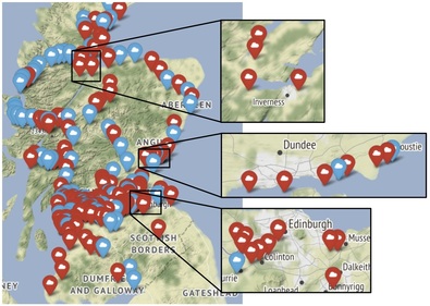
As a result, I decide to update my hypothesis:
H2: The Gaelic and English names of a station become more similar the further the station is from its closest city.
Feature Extraction
To perform a statistical analysis, I needed to map each station’s data to a datapoint of the form (x,y) – where x represents the similarity between the Gaelic and English names of the station and yrepresents the distance of the station from its closest city. Computing x for each station was simple:
X = data.apply(lambda row: fuzz.ratio(row['English'],row['Gaelic']) , axis=1)
print('\n',X.head())
#
#0    36
#1    38
#2    73
#3    50
#4    62
To compute y for each station, I used the Python GeoPy package to request the Latitude and Longitude coordinates of the geographical centers of cities in Scotland:
from geopy.geocoders import Nominatim
locate = Nominatim().geocode
city = ['Glasgow','Edinburgh','Aberdeen','Dundee','Inverness','Stirling']
city_loc = list(map(lambda x:(x.latitude, x.longitude), map(locate,city)))
I then created a Rural Score function (rscore) to calculate how far each station is from its closest city:
import numpy as np
from geopy.distance import vincenty
def rscore(city_loc,station_loc):
    return(np.min(list(map(lambda x: vincenty(x,station_loc).miles, city_loc))))
Finally I computed y for each station:
Y = data.apply(lambda row: rscore(city_loc,(row['Lat'],row['Lon'])), axis=1)
print('\n',Y.head())
#
#0     1.658797
#1     7.851104
#2    25.624060
#3    30.679564
#4    39.639464
Statistical Analysis
For the statistical analysis I simply used the Python Seaborn package and the Spearman’s rank correlation coefficient function from the Python SciPy package:
import seaborn as sns
from scipy.stats import spearmanr
XY = pd.DataFrame({'Name Similarity':X, 'Rural Score':Y})
plotOps = {
    'x':'Name Similarity',
    'y':'Rural Score',
    'data':XY,
    'stat_func':spearmanr
}
plot = sns.jointplot(**plotOps)
plot.savefig('plot.png')
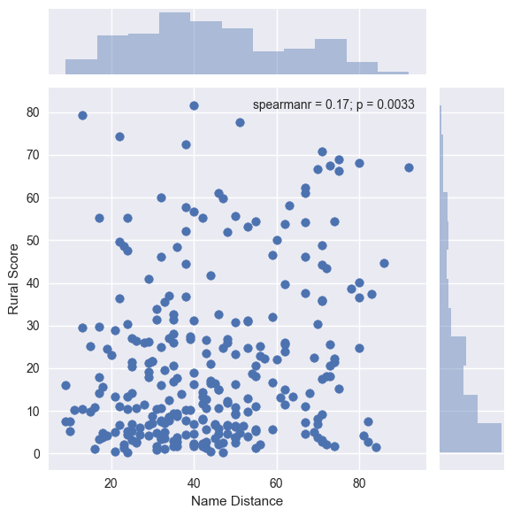
This resulted in the plot:
Discussion
The distribution of rural scores is what one might expect, given there are most likely more stations nearer to city centers. The distribution of name similarities appears to be bimodal and it would be interesting to investigate this further. There is not a clear relationship between name similarity and rural score, but the p-value of the statistical test is 0.0033. This could be interpreted to mean the correlation between name similarity and rural score is significantly different from zero (for most commonly used significance levels), but it is important to note the size of the correlation is low at 0.17. I take this to mean I wasn’t completely wrong, but some further investigation is required.
Future Work
This investigation leads to some interesting avenues for future work. It would be interesting to investigate why some stations do not have Gaelic names, and to look at specific train routes to see if the similarity between the Gaelic and English names of stations increases as one travels out of the city compared to urban commutes. It would be interesting to explore similarity measures that deal differently with the accents in Gaelic, or similarity measures at the phonetic- or even semantic-level. Finally, it would be interesting to move beyond calculating a rural score based only on the distance of a station from its closest city, and to explore potential underlying social factors that might contribute to differences in a station’s Gaelic and English names.
Feel free to follow me on Twitter: @TheLeanAcademic. Thanks!
Leave a Reply